-
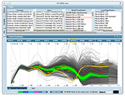
1/10 Get a quick overview of what is in your table. How many items are there? How do they group? Are there outliers? See all the categorical columns (along the top) and all the numerical columns (graph at the bottom). Each row in the table corresponds to one line in the graph. The image shows the characteristics of all the Tour de France bicycle races from 1903 until today. The two gaps on the first axis (year) corresponds to the two world wars. There seems to be a negative correlation between the length of the race and the average speed of the winner. Of 98 races there are only 57 individual winners coming from 13 countries.
-
2/10 Obtain details on demand. Hover the mouse over any line in the graph to see its details. At the same time, the overview does not get lost but provides the context in the background. The image shows the details for the 1971 Tour won by Eddy Merckx.
-
3/10 Detect outliers. Outliers and other interesting cases are easily spotted, analyzed and interpreted. The very first few Tours were quite short. This abruptly changed after 1905 when the Tours were much longer even than today's editions.
-
4/10 Filter on categories. With a simple click of the mouse, individual categories or combinations thereof can be filtered. The filtered-out items are shown dimmed in the background so as to preserve context. The image shows all the Tour wins of French rider Bernard Hinault. Another click quickly reveals that he was the last French rider to win the Tour de France since 1985.
-
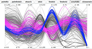
5/10 Use different rendering options. One of the more important rendering options is how to connect the values on each of the axes. There is a choice between curved lines, straight lines, and a stepped variant of straight lines that better shows how the values are distributed on an axis. The images show eight properties for each of 572 samples of olive oil from different regions and areas of Italy.
-
6/10 Use different rendering options. One of the more important rendering options is how to connect the values on each of the axes. There is a choice between curved lines, straight lines, and a stepped variant of straight lines that better shows how the values are distributed on an axis. The images show eight properties for each of 572 samples of olive oil from different regions and areas of Italy.
-
7/10 Use different rendering options. One of the more important rendering options is how to connect the values on each of the axes. There is a choice between curved lines, straight lines, and a stepped variant of straight lines that better shows how the values are distributed on an axis. The images show eight properties for each of 572 samples of olive oil from different regions and areas of Italy.
-
8/10 Filter on numerical attributes. The sliders on each axis can be moved, to limit the visible items to a specific range of values. The image shows how the choice of ranges limits the samples to just three areas.
-
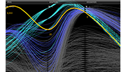
9/10 Discover outliers across several attributes. Even with two axes restricted to narrow bands there are still strong outliers.
-
10/10 Color interesting items. Groups of items can be easily assigned a color in order to compare them to other groups. The image shows all the samples coming from Sardinia. With the colors it is easy to highlight that there seem to be two types of oils coming from that region, and how the two types are characterized.
Lost in too many variables and data records?
Here’s a better way to approach multidimensional visual analytics.
Discover the power of parallel coordinates
High-D is a versatile tool for uncovering hidden patterns, highlighting trends and relationships, and
detecting anomalies in datasets of any size. At its core is a powerful, interactive parallel coordinates
plot designed for rapid data exploration, analysis, and presentation. Importing data from a wide range
of file formats and databases is effortless—and High-D scales seamlessly to big data.
Extract insights from visual patterns
Parallel coordinates work by representing each data column as a vertical axis, with each record drawn as
a polyline connecting values across the axes. By leveraging our innate pattern-recognition abilities,
multivariate relationships can be identified almost instantly. High-D’s unique density-based rendering
prevents overplotting, while the choice between straight and curved geometries allows trends and
correlations to emerge clearly.
Find the gold-plated needles in a haystack
High-D offers rich interactive features, including direct visual brushing and filtering, complemented by
an intuitive, iTunes-like column browser. The visualization is highly configurable: axes can be
reordered, rescaled, or grouped together, and numerous options allow precise fine-tuning of both layout
and appearance.
Available today for Windows, macOS, and Linux
Macrofocus High-D is
priced
fairly priced at US$199 per user, with volume discounts available. Try it today with a free
30-day evaluation license. YYour feedback is welcome and highly valued by our
support team.